
|
Once upon a time there was a celebrated Finnish telecom brand called Nokia. Nokia was the king of mobiles, an undisputed market leader across the globe with instantly recognizable devices, celebrated marketing campaigns and the famous signature logo, the holding hands.  Most of us, no matter what country we were living in, had a Nokia as our first mobile. In 2007 Nokia had almost 35% of the mobile and 50% of the smartphone market, it was perceived as one of the most valuable and admired brands in the world.  Today, Nokia is a far cry from where the brand once was and its new owner Microsoft has just announced that they will drop the Nokia brand from smartphones. How could it all go so wrong? There are several causes of the downfall and it can be an important lesson to learn also for brands in other industries. The rise and fall of a brand can be difficult to predict and almost impossible to stop when the snowball has started to roll. Looking at Nokia, despite being a dominant market leader the company failed to recognize the drastic change in the industry and rapid transition of mobiles into smartphones. Being a company dominated by engineers, it focused more on hardware than software, which was an underestimation that proved fatal. As a comparison, when Steve Jobs launched the iPhone in 2007, Apple understood that design was important but that the rest was all about the software and attractive applications. Nokia’s choice of future operating system turned out to be a big mistake, first going with Symbian and then changing to Windows instead of launching Android as most of their competitors did, except Apple. It also appears that Nokia’s management spent too much time with internal politic and was not agile enough when it came to important decision making. They – and their teams – seem to not have prioritized to keep an ear on the ground, recognizing what was happening with the market and their customers. As a final straw, Nokia clearly overestimated the strength of its brand. Competing in a high tech industry means that customers will expect constant innovation from your brand to stay loyal and Nokia did not manage to deliver on that. Instead it was perceived as behind its competitors and quickly lost market shares to Samsung, Apple and HTC. Image concerned customers did not want to be seen with a device that was not perceived as “cool” anymore, but more associated with bus drivers and low income classes. Once an aspirational brand, Nokia’s image quickly faded away and the company was forced to close down its flagship stores all over the world . When the Microsoft acquisition of Nokia was finalised in April 2014, an era was coming to an end. Recently it was announced that the Nokia brand would be dropped from its Lumia smartphones but continue to feature on lower-priced feature phones for the next coming years. It's sadly the end of the road of Nokia as a mobile leader. Once Finland’s most beloved company and one of the world’s most prominent brands will soon end up in oblivion. A learning from the case of Nokia is, never become a complacent brand. 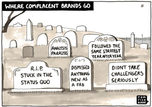 Will it be possible to rebuild the Nokia brand? Maybe. Nokia comes from a background as a conglomerate with many crucial mobile industry patents up its sleeves. Clues to their future lie within the new strategy and management. Lets see what 2015 will bring and if there is a chance for a revival of the brand. Image sources: nokia.com, journeyguy.com, tom.fishburne, techinasia.com, techcrunch.com. A brand is more than a logo. You have probably heard that statement before and it still holds true. A brand is defined by many intangible and tangible factors that together create an impression in the mind of a person. Intangible factors are the brand promise, expectations, experiences, perceptions and brand personality. Tangible factors are marketing, packaging, retail and of course the visual identity. When creating a visual identity there are some basic elements that build the foundation for a brand: logotype, symbol, typeface, colours, grid and photography style. Nevertheless, the main recognizing and brand building element is often the logo. On the other hand, what would be the impact if we exclude the logo? Are there any other visual elements that can contribute to creating a recognizable and unique brand? The answer is yes. Below are some examples of successful brands who have differentiated themselves through the use of distinct visual cues other than the logo. By using any of these techniques you can increase the possibility to create a unique brand that customers immediately identify as yours. Colour The colour of your brand can be a very strong cue in differentiating your brand. A unique colour or colour combination can ensure your brand to stand out in your category or even in the entire market place. Pattern A unique pattern can be a strong signal for a brand to be immediately recognizable. It can be applied on different products and advanced into a family of similar design patterns, endowing the creation of a heritage brand. Form An iconic form will help customers to recognize your products immediately, despite the absence of a logo. Brands within the consumer goods industry have been particularly successful in creating distinctive forms, allowing their products to stand out on crowded shelves. Packaging A unique, quirky and clever packaging will not only differentiate your product from the rest, it will make it more attractive and can even put a smile on your customer. First impression last and creative design can make a significant difference. It is easy to believe that the logo is the central element in a brand's visual identity. The fact is that a brand consists of many components that works together to create the brand impression. Successful brands can be characterized through their ability to utilize key elements, such as visual cues, that make them unique and enable them to stand out against their competition.
Let us know if you want your brand to be more than a logo. Image sources: Lorien, Flickr, Webdesign, Iloveprints, Missoni, agentofstyle, Paul Smith, freecodesource, Burberry, Salon of the dames, Heinz History, The inspiration room, advertolog, Toxel, Behance, Corinne Pant, AH & OH, Hiroko Sanders, BQB Yahoo has recently unveiled their new logo after a 30-day campaign during which a variation of the logo was presented each day on the company web site, then the final candidate was launched. The new logo has been designed by CEO Marissa Mayer and a team of internal designers during one weekend in summer. The background due to Mayer: “We knew we wanted a logo that reflected Yahoo – whimsical, yet sophisticated. Modern and fresh, with a nod to our history. Having a human touch, personal. Proud.” OLD LOGO  NEW LOGO  The revamp is the first major identity change in Yahoo’s 18-year history and this could have been a great opportunity to signal a positive change for the company. Instead the designers have left more or less all major elements of the logo intact except for the font where the elaboration has been focused. Unfortunately the new logo does not really fit Mayers brief as it feels more engineered, structured and boring than fresh and modern. More business-like than whimsical and personal. The new font also makes it look more like a brand in the beauty sector than a proud internet brand. Out of the 30-day campaign I believe there were several options that suited the brief better than the final one.
The feedback from the public has so far been mainly negative where a majority prefers the old logo. That can be due to the fact that most customers don’t like changes. However, don't forget the disastrous feedback that GAP, Tropicana and British Airways faced from their customers when conducting big rebranding projects. This lead them to change back their identities causing big costs and embarrassment. Branding is an important strategic discipline and a rebranding is a big operation for any brand. A new logo should be a core element of a professionally planned brand launch consisting of a new brand strategy, new vision, new brand positioning, new customer promise etc. Yahoo should therefore have focused their efforts on defining a strong brand foundation including the elements just mentioned, then using good creative design to conceptualize the brand strategy into a visual identity where the logo is a main expression. Just re-designing the old logo makes this look more like a cosmetic overhaul than a much needed signal of strategic brand change. In the highly competitive arena where Yahoo is playing, they need to be able to tell customers why they should choose Yahoo and what makes Yahoo different. A "new" logo is not enough. |
AuthorRosie Kropp, Categories
All
Archives
March 2015
|


 RSS Feed